This is the actual report provided to the client:
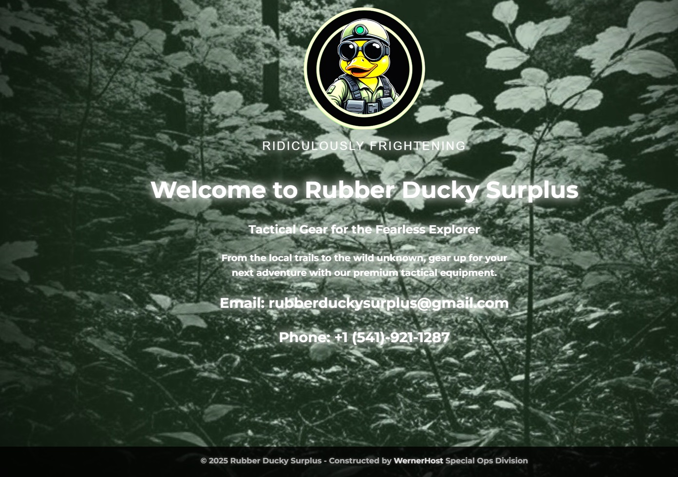
We’ve successfully designed and finalized the Rubber Ducky Surplus website, achieving a white phosphor night vision aesthetic that enhances the brand’s tactical theme. The site features a forest background, a subtle green-tinted overlay, white noise, a pulsing effect, a vignette, and glowing white text with hover interactions. The layout is balanced, with clear readability and a cohesive look across devices. Below is a detailed breakdown of the work completed, the design choices made, and the reasoning behind the night vision effect.
Key Design Elements
- White Phosphor Night Vision Aesthetic:
- Understanding Night Vision Types:
- Traditional Night Vision: Typically uses green phosphor, resulting in a monochromatic green hue (e.g., rgba(0, 255, 0, …)). This is the classic night vision look, where everything appears in shades of green.
- White Phosphor Night Vision: A modern technology that uses white phosphor, producing a grayscale image (shades of white, gray, and black) with a subtle green undertone. This gives a more natural, high-contrast look compared to traditional night vision, often used in advanced tactical gear for better clarity and depth perception.
- Implementation: We opted for a white phosphor night vision aesthetic to align with the brand’s premium, cutting-edge identity. The site uses a grayscale base with a faint green tint (rgba(150, 255, 150, 0.2) with opacity: 0.4) to mimic the white phosphor look, avoiding the overly green appearance of traditional night vision. This was achieved using a body::after overlay, layered above the forest background and white noise but below the content.
- Forest Background:
- A dark forest image was used as the background to provide depth and context, reflecting the “wild unknown” theme of the brand. The background is set to background-size: cover and background-attachment: scroll (adjusted for mobile compatibility) to ensure it fills the screen and renders correctly across devices.
- White Noise and Pulse Effect:
- A white noise texture (body::before) with a pulsing animation (opacity: 0.4 to 0.6 over 2 seconds) was added to enhance the night vision effect, mimicking the grainy look of night vision goggles. The mix-blend-mode: overlay ensures the noise integrates with the forest background, and opacity: 0.8` on mobile increases its visibility.
- Vignette Effect:
- A vignette (radial-gradient(circle, transparent 40%, rgba(0, 0, 0, 0.9) 100%)) was applied using a .vignette-overlay div, darkening the edges of the screen to focus attention on the center content, a common trait in night vision visuals. This is set at z-index: 3, above the green tint but below the content.
- Glowing White Text:
- All text (slogan, heading, tagline, paragraph, and contact info) uses white (#FFFFFF) with a glowing shadow. This mimics the way bright objects appear in night vision, with a white-hot glow.
- A hover effect increases the glow on all text elements, enhancing visibility and interactivity.
- Glitchy Logo:
- The logo features a glitch effect using clip-path and animations (glitch-slice-top and glitch-slice-bottom), adding a tactical, techy vibe. It’s set to filter: brightness(1.5) to ensure it stands out against the background.
Mobile Optimization
The design was initially optimized for desktop but required adjustments for mobile devices, particularly on iPhones with status bars/notches. Here’s how we addressed mobile-specific issues:
- Logo Positioning:
- On mobile, the logo was overlapping with the status bar (time, battery, Wi-Fi). We increased the header padding to calc(4rem + env(safe-area-inset-top)) for devices up to 768px and calc(5rem + env(safe-area-inset-top)) for devices up to 480px, but who’s rolling with the old flip phones really anymore? This ensures the logo is fully visible by accounting for the safe area on notched devices.
- Text Readability:
- The white text was hard to read on mobile due to the forest background and night vision overlay. We added a semi-transparent black background with small padding to all text elements (.slogan, .hero h2, .hero .tagline, .hero p, .contact-info p) in the mobile media queries. This improves contrast and readability while maintaining the night vision aesthetic.
- Night Vision Look:
- The site appeared “too white” on mobile, losing the white phosphor look achieved on desktop. We adjusted the following in the mobile media queries:
- Changed background-attachment to scroll to ensure the forest background renders correctly (as fixed doesn’t work well on mobile).
- Increased the green tint to rgba(150, 255, 150, 0.4) with opacity: 0.6 to make it more visible.
- Raised the white noise opacity to 0.8 and adjusted the filter to brightness(1.3) contrast(1.5) saturate(0.7) for a stronger night vision effect.
- Strengthened the vignette to transparent 40%, rgba(0, 0, 0, 0.9) for a darker edge effect.
- Layout Adjustment:
- Used justify-content: space-between on the body and justify-content: center on main to distribute content vertically, filling the space at the bottom and ensuring the layout looks balanced on mobile.
Why We Chose This Approach
- White Phosphor Night Vision: We chose white phosphor over traditional night vision to give the site a modern, premium feel that aligns with the brand’s focus on high-quality tactical gear. The subtle green tint (rgba(150, 255, 150, 0.2) on desktop, 0.4 on mobile) ensures the white phosphor look (grayscale with a faint green undertone) without the overly green appearance of traditional night vision.
- Glowing Text: The white text with glowing shadows mimics how bright objects appear in night vision, ensuring high visibility. The hover effect enhances interactivity, making the site engaging.
- Mobile Optimization: The adjustments for mobile (safe area padding, semi-transparent backgrounds, enhanced overlays) ensure the design is consistent across devices, addressing readability and layout issues specific to mobile screens.
